Ghost Note Agency Rebrand
Overview: Ghost Note Agency wanted to update their overall brand and visual identity. The partners realized that they weren’t telling the full story of family, culture, growth and grit that they thought made them special. They wanted to update the look and feel of their brand to showcase more of the Ghost Note story and personality.
Programs Used: Adobe Illustrator, Adobe Photoshop, Adobe InDesign, After Effects and Mailchimp.
Main Role:
Helped and collaborated on the creation of the updated Ghost Note visual i.d.
Took lead on establishing initial brand assets such as the Ghost Note brand process document, capability document, social media graphics, presentation decks, etc.
Responsible for establishing brand consistency throughout the agency.
Credits:
Designers: Kristine Garcia, Pete Brown, & Justin Kalaskey.
Videographer + Motion Designer: Ariel Chu
Art Director: Kristine Garcia
Creative Director: Reggie Snowden
Initial Brainstorm, Sketches & Explorations
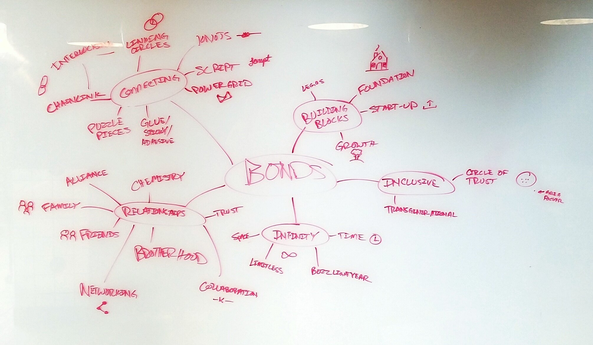
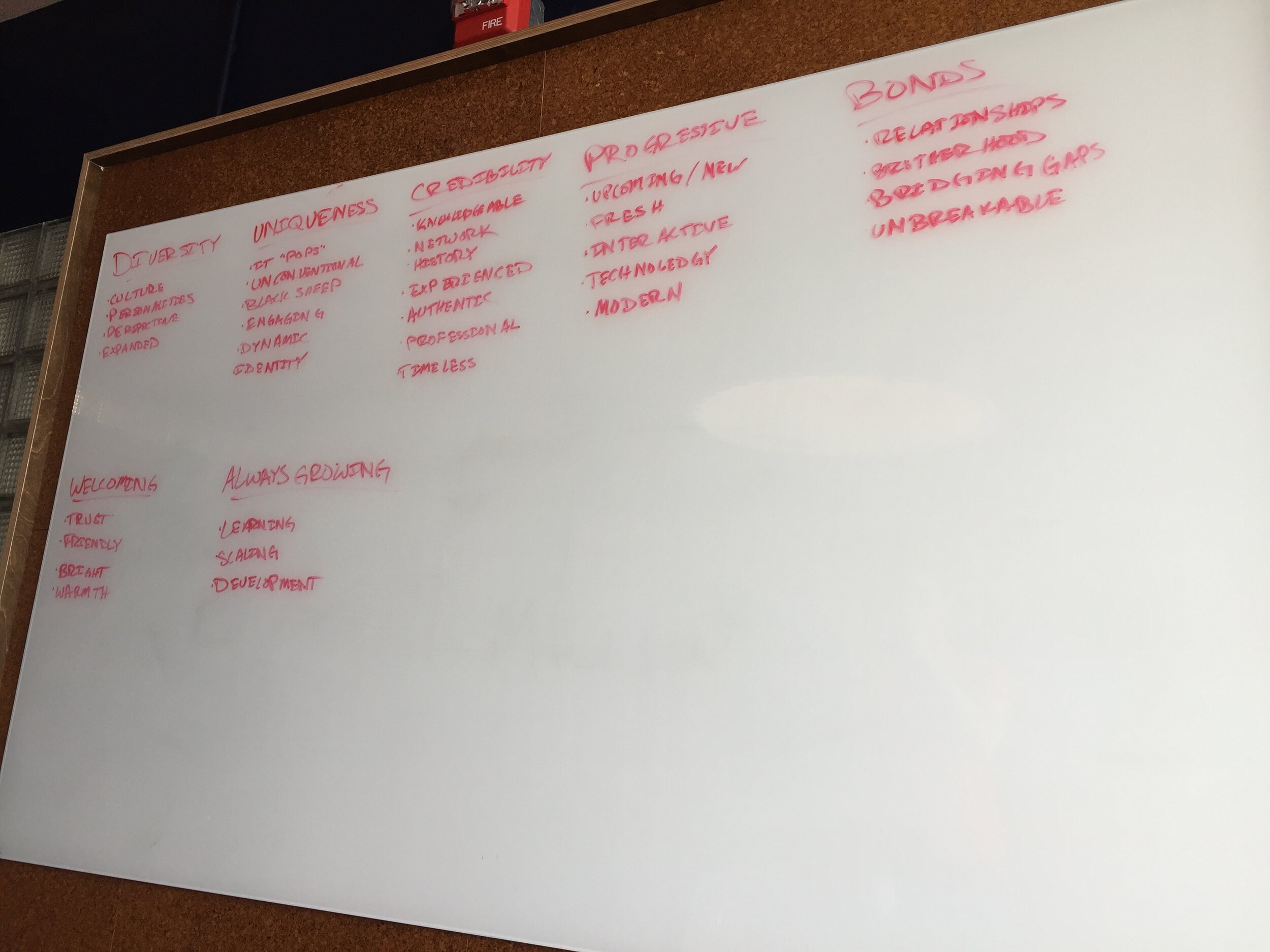
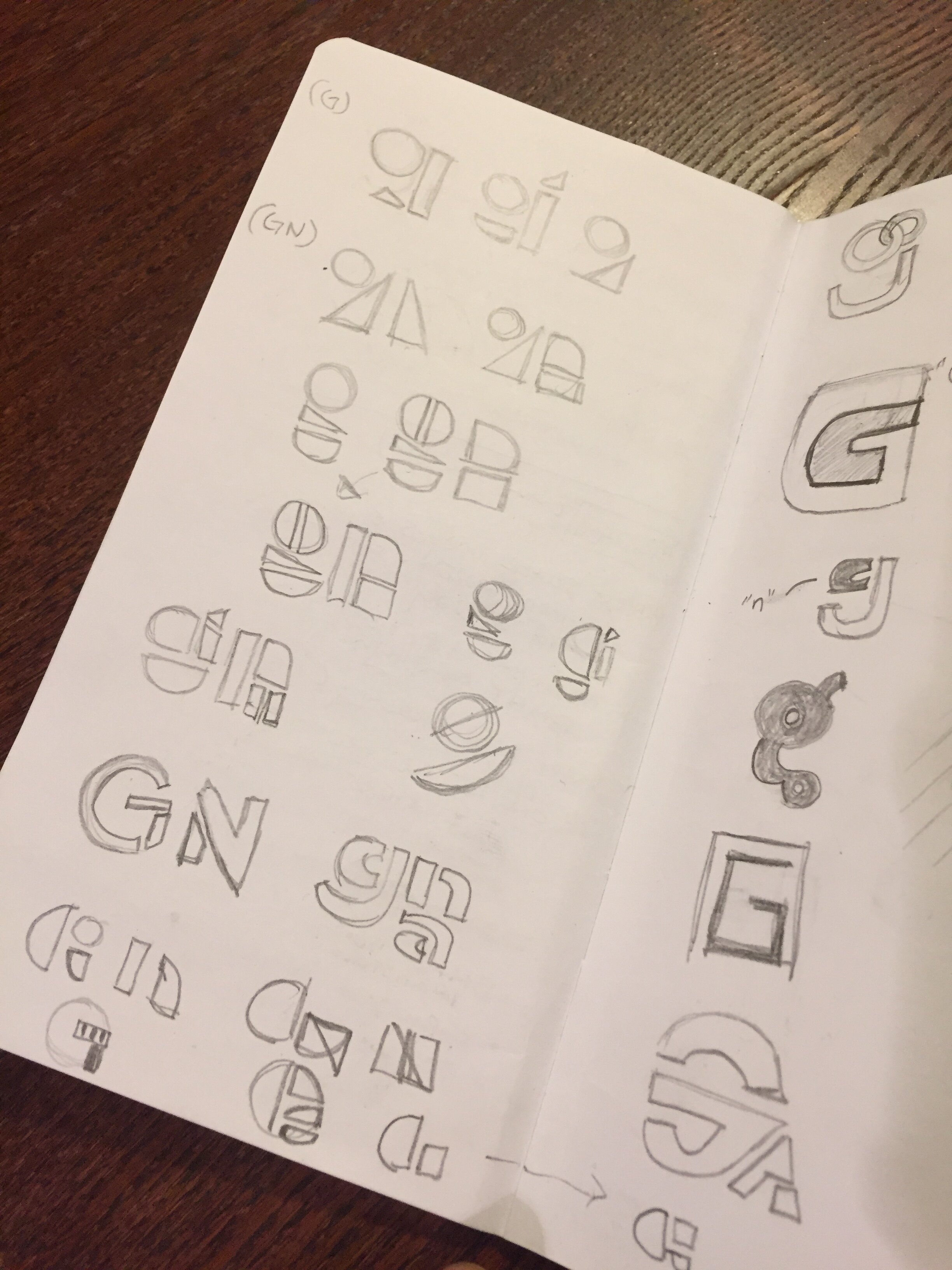
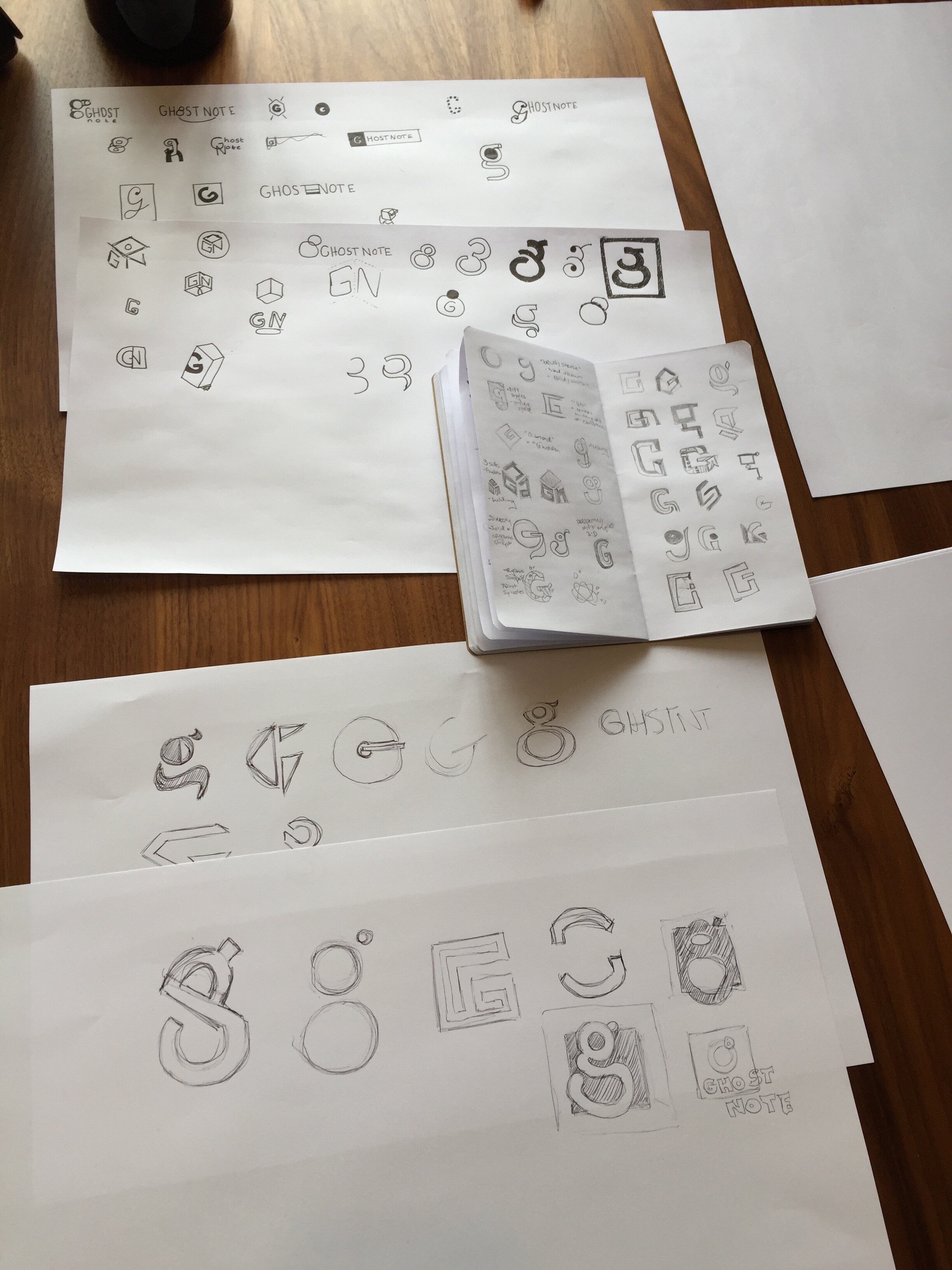
The following photos capture the initial process in establishing the Ghost Note brand. White board sessions that include word associations and web diagrams were key to the development of concepts. Rough sketches were also created to expand on some of the concepts that were brewed from the brainstorm sessions.
The chosen design direction was meant to embody a spirit of bonding, growth, community and diversity. The geometric theme centered around simple, varied and precise shapes coming together to create something complex and cohesive - the abstract “Ghost Note ‘g’”. The top half, that includes the two circles, are meant to convey a subtle nod to the previous brand mark. The additional shapes signifying the growth and evolution of the company. The concept is strong in its core application, but still versatile enough to allow the exploration of unique and creative extensions of the brand.
The updated Ghost Note logo is meant to be simple, bold and intriguing. A pencil sketch and computerized iterations of the logo was created. The final decision was made on the complete structure and accompanying frame. A grid system was used to refine the mark and establish proper proportions.
We conducted research on colors using various outlets and mediums for inspiration to choose an appropriate, cohesive palette.
The color palette is unique, fresh and vibrant to showcase the agency’s personality. Green and navy blue were the primary base, with light blue as an accent pop color. These colors offer a bold yet professional balance that can support a flexible and scalable brand. To that end, we also established a secondary palette to compliment the primary palette.
A unique frame was incorporated to house the logo mark. The alternating sharp and rounded corners are inspired by the sharp and rounded edges of the shapes within the logo mark. This consideration also informed the typeface selection. The “Ghost Note frame” serves as a portal for telling the story through bold imagery. The frame can also help focus on a particular subject matter. Additionally, the frame can interact with the images that it is framing.
Once the palette was established, the next step was implementing and marrying all of the elements of shape, type and color together. A few alternate approaches in presenting the logo are showcased above.
A recurring theme in much of the decision-making process has been versatility. One of the goals was to establish a flexible and scalable brand that allows for a variety of creative uses. Ultimately, Ghost Note wanted a brand and visual identity to serve as vehicles for greater storytelling.


